Data analyst? You must be familiar with both Tableau and AWS Redshift. And you must know, or at least you should believe me that integrating the Redshift columnar-based database speed with the mature, rich and interactive Tableau creates an awesome experience.
In my article last week, I described how to create custom Google Analytics dimensions, export the data, and import it to Redshift cluster. Don’t miss it since this one is a continuation of it. In this short one, I will take you through the integration process, through to the eventual presentation of an aggregated graph of pageview performance by number of visitors.
Note: In this guide we used Tableau desktop version 10.0, which you can easily download and try for free. Once downloaded and installed, you can perform the following steps to connect it with Redshift. It will also help to ensure you have your Redshift information (host name, database name, username and password) on hand.
Connect
On the Tableau Desktop start page, under Connect, select the Amazon Redshift option.
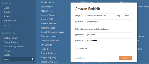
Enter your Redshift information and click Sign In.
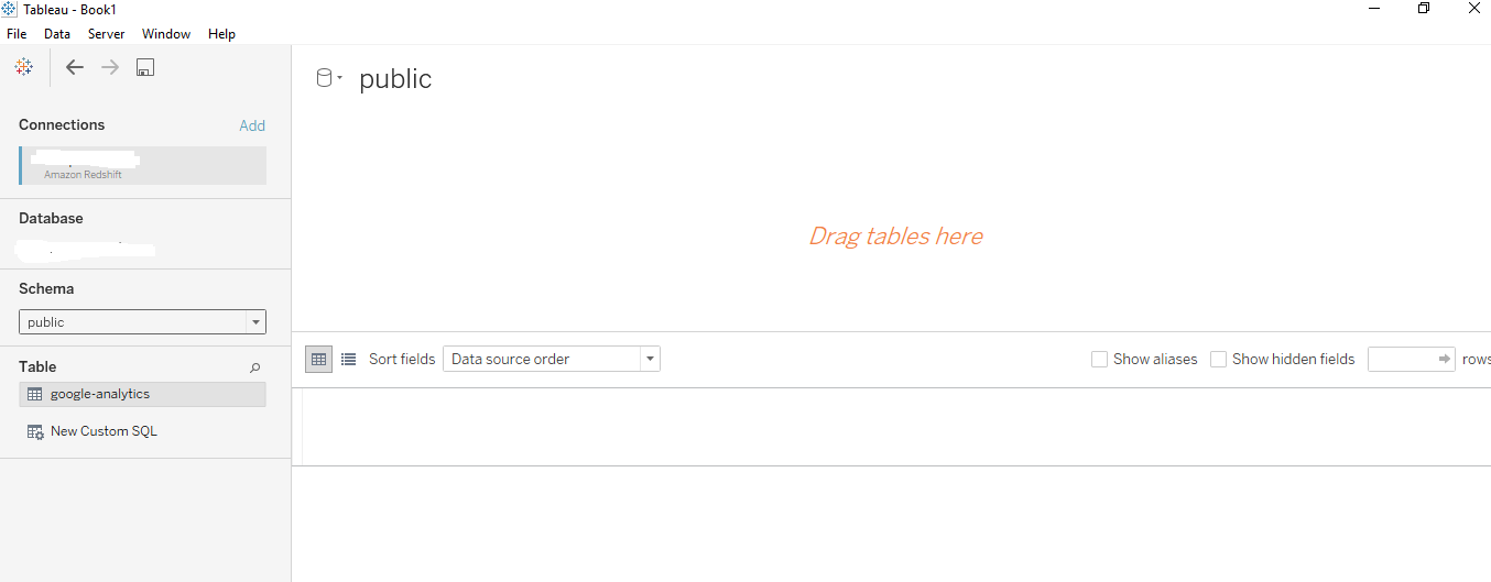
On the data source page (shown above), do the following:
Click the data source name at the top of the page, then enter a unique data source name for use in Tableau. It’s good practice to use a data source naming convention that helps other users figure out which data source Tableau is connected to.
From the Schema drop-down list, select a schema or use the text box to search for a schema by name.
Under Table, select a table or use the text box to search for a table by name.
Drag the table to the canvas, then click the sheet tab to start your analysis.
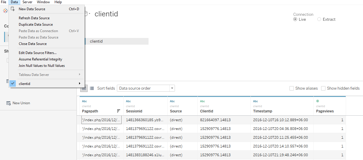
Now that Tableau is connected to our Redshift database, we can move onto visualizing it.
Visualize
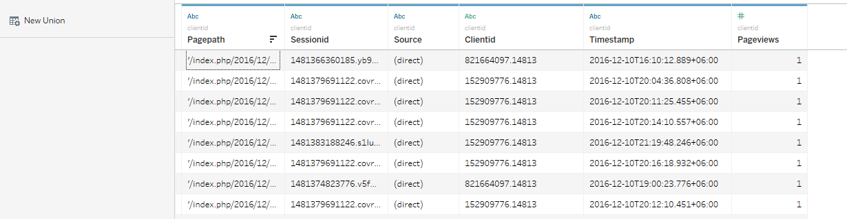
From the Tableau Desktop menu bar, select Data and then select a table from list data source tables at the bottom of the popup menu. For our example, we wanted to create reports and charts based on the Clientid table (as shown below).
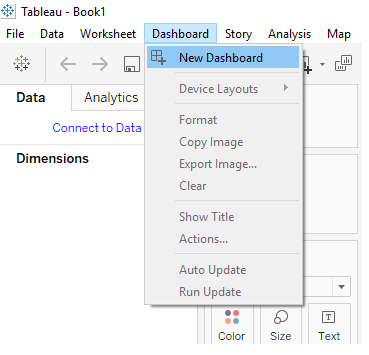
Next, on the menu bar, select Dashboard > New Dashboard.
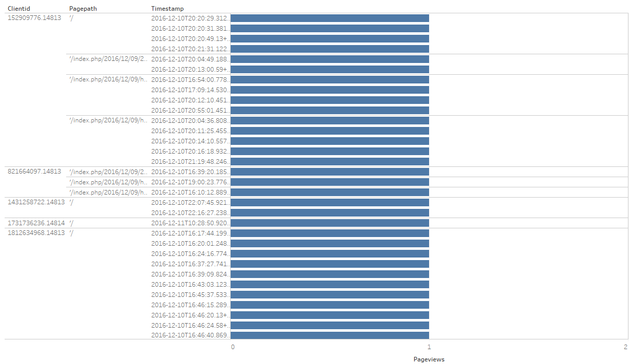
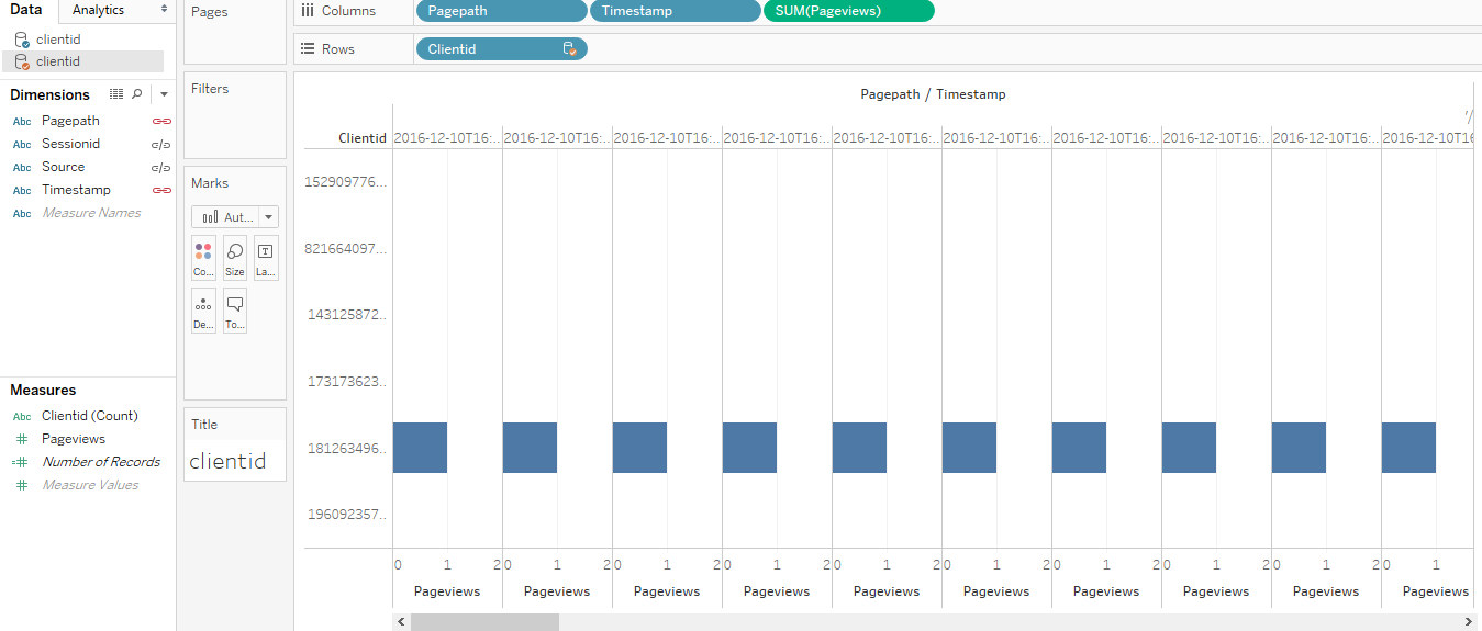
A graph is displayed, returning the number of page views by Timestamp, PagePath and Clientid:
As shown in the steps below, from this point on we can experiment with Tableau’s simple UI and filters to visualize the data based on our specific business requirements:
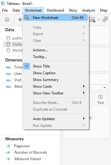
On the menu bar, select Worksheet > New worksheet.
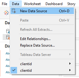
Next, on the menu bar, select Data > Users.
From the Dimensions and Measures sections in the left pane, you can adjust the worksheet, selecting the relevant columns and rows.
For example, the screenshot below shows which pages have been viewed and how many times, by date.

Alternatively, if you want to look at a specific Clientid (information not supported out-of-the-box by GA), you can create a graph similar to this one:
Number of Page Views by Specific page by Specific Clientid and by Date
Or, by making a few simple changes to the arrangement of your data, you can create a different visualization for the same example:
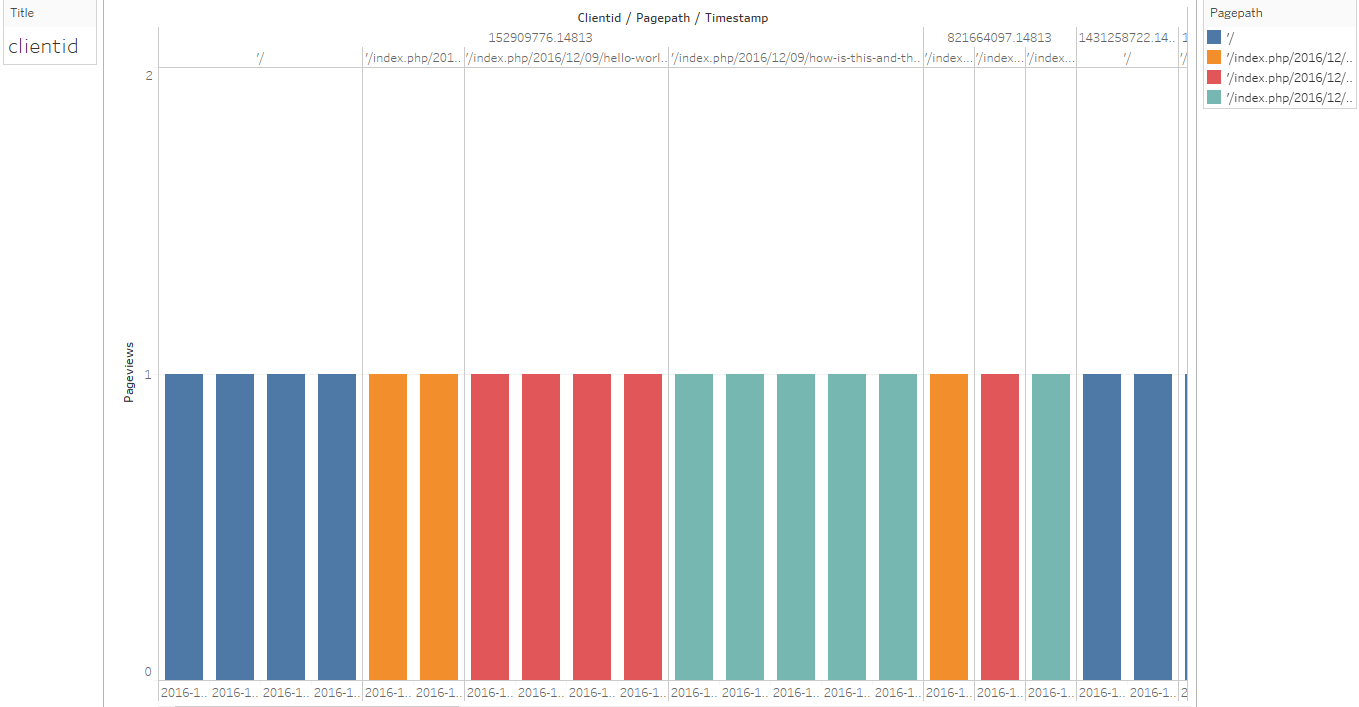
Number of Page Views by Specific page by Specific clientid and by Timestamp.
As can you see, using Tableau Desktop offers a simple way to start visualizing your Redshift data.
The easier way: Using Panoply
The integration between Tableau and Redshift is a powerful one. However, there are lots of preliminary steps that are required to make it happen, which can make the whole process cumbersome, lengthy and hard to maintain.
In a real-life use case, your database will hold more than two tables and will need to be continuously processed to be ready for visualization.
That's where Panoply comes into play:
Panoply provides a one-stop data warehouse solution, from extracting the data source right through to load and transform. Besides out-of-the-box integration with Tableau, Panoply services also integrate with other external BI tools such as Metabase, Looker, and Power BI.
Connecting Panoply to Tableau is simple: Just enter a few fields' worth of credentials and you're ready to go. To learn more, schedule a personalized demo today.


